In a blind panic the other day (yesterday to be exact) not only was I fretting about logo’s (see previous post) I also decided I do not have enough knowledge of Photoshop. Now I would probably say I’m not too bad at using it, be it from a Photography point of view or indeed Design. But bloody ‘ell, it’s only when you start messing around with tutorials in order to brush up on your ‘skills’ do you realise just how much you DON’T know. Such as layer masks for instance, I’ve been using Photoshop in such a cut n’ paste kind of way for so long it almost seems like an alien concept to use non-destructive actions. The image you see here was made after going through an old Computer Arts tutorial by James White, I wanted to try and learn a technique that looked a bit slick and polished and almost glowing. I didn’t follow the tutorial too closely as I just wanted to understand the general principles behind the concepts, but boy do I have loads more to learn. It also didn’t come out ‘glowy’ or slick enough for me so I guess I’m going to have to hunt down some more knowledge online, because they sure aren’t going to show me at Uni (how sad). Like I said the tutorial was by a Canadian designer named James White and I’m really digging his style and well, all of his work really, especially his latest stuff such as movie posters for the films Drive and Terminator 2. Be sure to check out his blog too (http://blog.signalnoise.com/) as it’s full of interesting posts, topics and mostly great design related mayhem!
In my determination to learn as much about design as possible I’ve realised I haven’t made nearly enough logo’s. Or at least not as many as I would have liked. I’m about to start the third year of a degree, and we’ve hardly touched upon such an important issue as logo design, which in my opinion is a bit ridiculous to say the least. A whole post devoted to the state of design education needs to be made another day as I’m sure it could take a while. So, the postman came today bearing fruits and also er… a book about logo design, tentatively titled Symbol (Angus Hyland & Steven Bateman). It features over 1300 ‘symbols’ divided into sector, designer and client all lovingly produced on high quality stock. It also includes a number of case studies on some of the more iconic logo’s such as Continental by Saul Bass and the CBS logo by William Golden, right up to more contemporary designs such Apple and Nike and well, any huge company and all of the obscure ones (including their logo’s) in between. It’s only just arrived so I can’t wait to really devour it and soak up all of the juicy goodness contained inside, I’d recommend it to anyone remotely interested in the art of logo design.
Just a quick one for anyone that cares about design, I have joined a new portfolio website. Why? Because, even though I’ve been on Cargo for a while now, it has always seemed a bit dead to me. There doesn’t seem to be a thriving community like there is on Behance where interaction and feedback seem to be the norm, which is far more exciting to me. You can have a look here http://www.behance.net/allanwilliams . I’ve added some new stuff here and there which was Thursday when I first opened the account and already people are looking at my work and commenting where as on Cargo, which I have been on for over a year, I haven’t had a single comment. Zero. So if you’re considering an online portfolio then go with….actually go with both! You can never have enough exposure and shameless self-promotion!
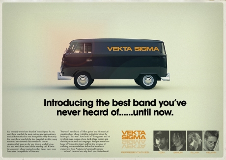
In between studying design and living and breathing, I play guitar in a monumental band called Vekta Sigma. I guess you can say we’re a guitar based alternative group if you like to pigeon-hole bands. Which we don’t, but hey. We have a brand new Facebook page up with lots of photos, music (obviously) and some new artwork which I have designed including posters and fake single covers and banners! It was great fun designing new stuff for the band, I didn’t do enough of that in the past but it’s so important to have a visual identity. You have to get that imagery and iconography out there so it was important to get the logo sorted properly first. We’ve had various ones in the past, some hand-drawn, but I thought it would be better if we had a versatile typeface for the logo instead. I chose Microgramma (also known as Eurostile) which is one I’ve waffled on about in the past on this very blog. It basically manages to look contemporary and fresh while retaining it’s retro roots all at the same ruddy time. Marvellous. If you wanna see more and hear the unquestionable originality of the tunes then head over to http://www.facebook.com/VektaSigma . We hope to add more music soon so stay tuned, I urge you.Hop over to my website too if you want to see the images in better quality:http://www.allanwilliamsdesign.com/ as Facebook seems to over-compress some images.
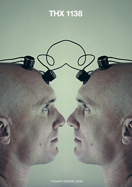
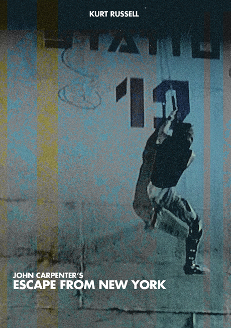
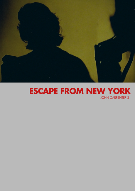
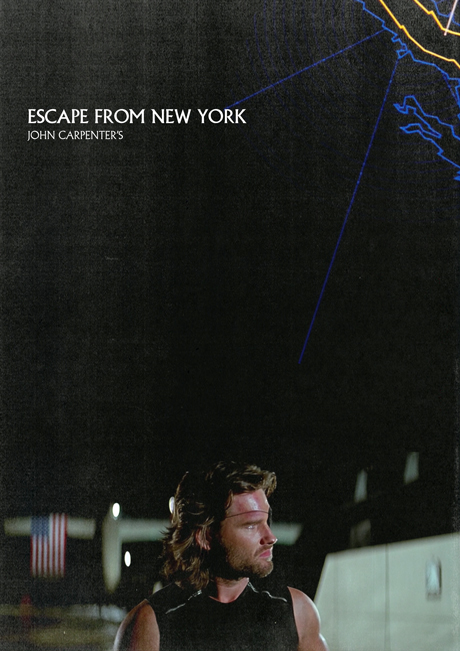
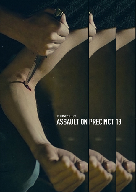
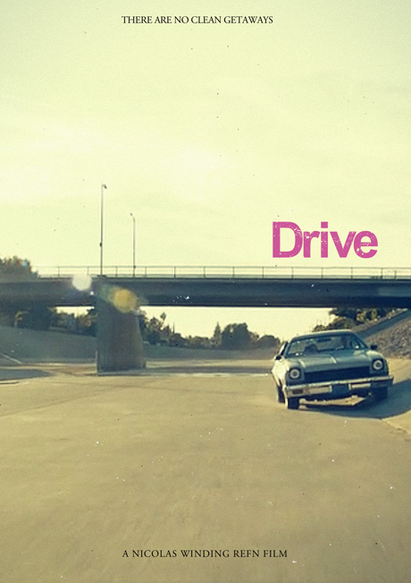
Working on the project posted previously, really helped wet my appetite for further movie poster madness. But with a slight difference. This time I wanted to work with established films to see if I can ‘re-imagine’ them in an interestingly minimal and contemporary way, much in the same vain as Criterion collection DVD covers, and world cinema titles by Artificial Eye and Tartan. You can see this kind of thing all over the web these days, it’s not too original but I wanted to do my version of this shindig just for fun which is why I tried to churn out a few real quick. BAM BAM BAM! That kind of thing. They were all made by just screen-grabbing the DVD at the right moments, and then some cut and paste magic was provided. It was fun to set these little challenges, they were like little design problems that had to be solved. Some were finished really quickly, others not so fast. But it keeps the skills fresh and prevents rust! I may do a few more soon, but I think a project like this could run and run and…………….
While enjoying an extended break over the summer I was asked kindly by a friend to collaborate on a book he’s currently working on. He wanted me to come up with a fictional film poster based on the phrase ‘Don’t judge a book by it’s cover’ I thought this was a great opportunity to work on a real project as the book will eventually be published too (obviously, it being a book and all). I also love designing posters, be it music or film. Here I went for the conspiracy angle in regards to not judging a book by it’s cover and went for the most, or at least one of the most famous conspiracies. Yes, yes, I know Lee Harvey Oswald probably did shoot JFK but the message I wanted to put across was; don’t merely accept the ‘truth’ always ask questions. The target audience for this book is aimed at fifteen year-olds so it needed to be a tiny bit obvious too, not too vague or ambiguous, or even obtuse. Most fifteen year olds haven’t even heard of those words either. Ha. No, seriously I’ll give ’em more credit than that. The final version is the bottom one and it didn’t come out too bad, but it is quite a challenge to work with tiny images at 72dpi taken from the sixties.
These are the original logos from the first nine european championships all of which England were crap at. I’m just distracting myself at the moment from the sheer embarrassment of watching England attempt to play football in the right way. These old logos don’t take me back to a time when England were any better, because as you all know we’ve always been terrible. These logos take me back to old Panini sticker albums, I did actually have a Euro88 one. Ahh great days. UEFA updated the logo from Euro96 onwards (when England were actually quite good) and have updated it for every tournament since (perhaps in a bid to give each tournament a sense of it’s own identity). I personally think the new logos look terrible and bland and corporate and ….. you get the idea. From the next tournament which will be held in France, the format will be extended to 24 teams which will dilute the quality of the Euros which most people believe is a far superior competition to the world cup. But no more, it will be big, bloated and mostly; boring. Just like the world cup. Another example of UEFA ‘reaching out’ and extending the football ‘family’? Or UEFA reaching out and guzzling on more corporate schlongs? FIFA and UEFA you make me sick, take your bungs and stuffed envelopes full of cash and frigg off. Anyway who cares, it’s only bloody football?
I just wanted to post a quick little er, post. I’ve defected from Google blogger which I could never get on with. If you want to see my old blog then here it is; http://allanvekta.blogspot.com/.It has always looked like WordPress has more potential, so here’s to a great future of no hair pulling and crying real tears because a file wont upload properly on to certain browsers! This blog may take a while to get up and running with good stuff about graphic design so please bear with me. In the mean time check out my website too: http://www.allanwilliamsdesign.com/ you good, good people.


